Viewing Data
Available to: All users Minimum plan: Free
The data grid is the primary interface for viewing reference data in TitanRDM. It provides a spreadsheet-like experience powered by AG Grid, with sorting, filtering, column management, and server-side pagination for large data sets.
Navigating to a Table
There are three ways to open a table's data grid:
From the Sidebar
- In the sidebar, expand the Tables section
- Expand the domain name node in the tree to see its tables
- Click a table name to open the data grid
The sidebar shows tables deployed on your current branch, organised by domain. Only tables you have permission to access are visible.
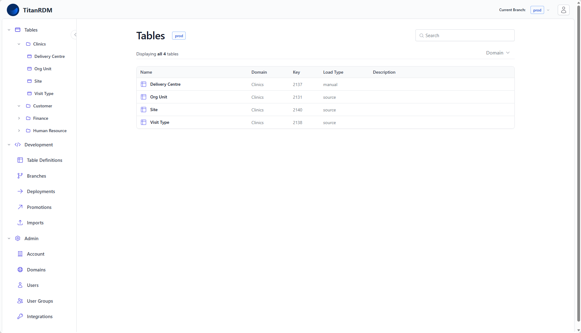
From the Tables Index
- Click Tables in the sidebar header (or navigate to
/tables) - Browse the paginated list of all deployed tables across all your domains
- Use the domain filter dropdown to narrow by domain
- Use the search bar to search by table name, database table name, description, or key
- Click a table name to open the data grid
From the Dashboard
The developer dashboard shows recently accessed tables and recent table definitions. Click any table name to jump straight to the data grid.
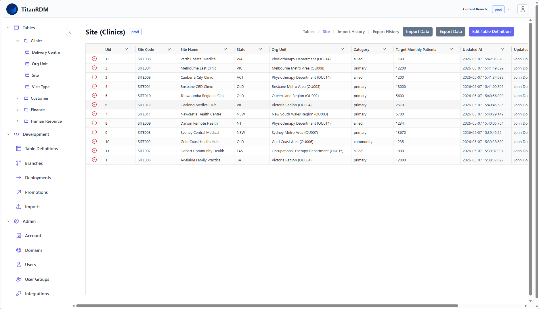
The Data Grid
When you open a table, the data grid fills most of the screen. It displays your table's columns from left to right in the order defined by the column definitions (display order).
Grid Layout
| Area | Description |
| Header bar | Table name, domain name, branch badge, breadcrumb navigation, and action buttons (Import Data, Export Data, Edit Table Definition) |
| Column headers | Column names with sort indicators. Click to sort, right-click for the column menu. |
| Data rows | Your reference data. Click any cell to edit (if you have permission). |
Sorting
Click any column header to sort by that column:
- First click: sort ascending (▲)
- Second click: sort descending (▼)
- Third click: remove sort
Multi-Column Sort
Hold Shift and click additional column headers to add secondary, tertiary, etc. sort levels. The sort priority follows the order you clicked.
If no sort is applied, records are shown in reverse chronological order by last update (trdm_updated_at DESC).
Filtering
The data grid supports column-level filtering to narrow down the displayed records.
Using the Column Menu
- Click the filter icon (funnel) in the column header
Filter types vary by column data type:
| Data Type | Available Filters |
| Text (varchar, character, text) | Contains, Not contains, Equals, Not equal, Starts with, Ends with, Blank, Not blank |
| Number (integer, decimal, etc.) | Equals, Not equal, Less than, Greater than, In range, Blank, Not blank |
| Date/Time (date, timestamp, etc.) | Equals, Not equal, Before, After, In range, Blank, Not blank |
| Boolean | True, False |
Combining Filters
You can filter on multiple columns simultaneously. Filters are combined with AND logic — a row must match all active filters to be displayed.
Clearing Filters
To remove a filter, open the column menu and click Reset.
Column Management
Resizing Columns
Drag the border between two column headers to resize. Double-click a column border to auto-fit the column to its content. The default display width for each column can be set on the column definition.
Reordering Columns
Drag a column header left or right to reorder columns within the grid. This is a visual-only change and does not affect the underlying column definition order. The default order of columns can be set in the table definition.
Pagination
The data grid uses server-side pagination (infinite scrolling). As you scroll down, additional rows are loaded automatically from the server. This means even tables with hundreds of thousands of rows load quickly — only the visible portion is fetched at any time.
The total row count is displayed in the grid status bar.
Branch Context
The data grid always shows data from your current branch. Each branch has its own physical database tables, so the data you see depends on which branch you are on.
The current branch is displayed as a colour-coded badge next to the table name:
| Badge Colour | Branch Type |
| Red | Shared/permanent branch (Production, Test, Development) |
| Green | Private feature branch (shows owner name) |
| Blue | Shared branch |
To view data on a different branch, switch branches first using the branch switcher.
Table Information
The table header shows the table name and domain name. If the table definition has a description, an information icon (ℹ) appears next to the name — hover over it to see the full description. This is useful for tables where the admin has provided instructions for data entry.
Action Buttons
The header bar includes quick-access buttons:
| Button | Description |
| Import Data | Navigate to the import page to upload a data file into this table |
| Export Data | Navigate to the export page to download this table's data as CSV |
| Edit Table Definition | Jump to the column editor for this table (Developer licence required) |
| Import History | View past imports for this table |
| Export History | View past exports for this table |
Related Pages
- Editing Data — inline editing, adding rows, deleting rows
- Importing Data — uploading data files
- Exporting Data — downloading data as CSV
- Table Definitions — how table structure is defined
- Branches — understanding branch context